Problem Statement
The spring of 2020 COVID-19 affected many businesses, including our client’s luxury transportation services. For this reason, our client needed help in attracting more clients through his website and communicating to his prospective customers the measures he was taking to keep his business safe and operational during COVID-19 times. The quarantine time also gave our client the opportunity to redesign his business.
Fancy limo is a limousine and helicopter tour company, based out of Atlanta GA. The business prides itself on offering a stress-free and professional experience with the best customer service. The main challenge was not having enough clients through the old website, even though they have exceptional reviews (4.8 out of 5 stars on google) Fancy limo was suffering from a lack of brand recognition, the business used different names for their google business registration, their old website, and business card design, which made it increasingly more difficult for new customers to find out about the business.
Logo Concept
Elegant & Classic: The use of the black color in the brand (think tuxedo elegant) to reflect the type of premium service that the business offers, we are talking FANCY (pun intended)
Classic almost vintage concept : to represent the many years of experience of the company. In other words fancy limo should inspire feelings of class, reliability, and experience. Or simply said “nothing like a good classic”
A limousine or abstract form of a limousine to represent the name and business (limousine)
Elegant yet NOT delicate in terms of design.
Business Cards
The business cards were designed with the intention to feel elegant, indicative of a premium service. The color black is carried out through out the brand.
Website
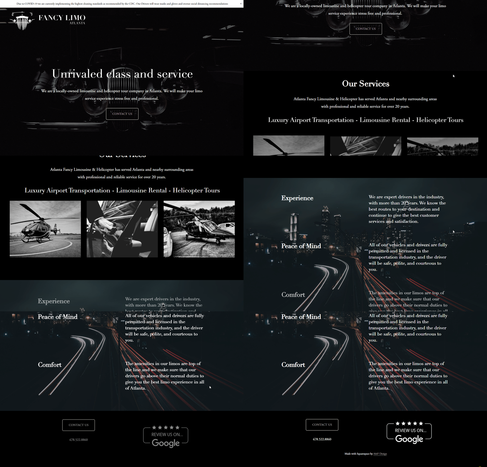
The new website maintains the same elegant look-and-feel as the logo and the business cards with dark colors. A responsive one-page design that provides easy-to-find information both on desktop or mobile devices. Additionally, the Google Business registration was updated with a consistent brand name, and Google reviews linked to the website to capitalize on the good reputation that the company already had.


